

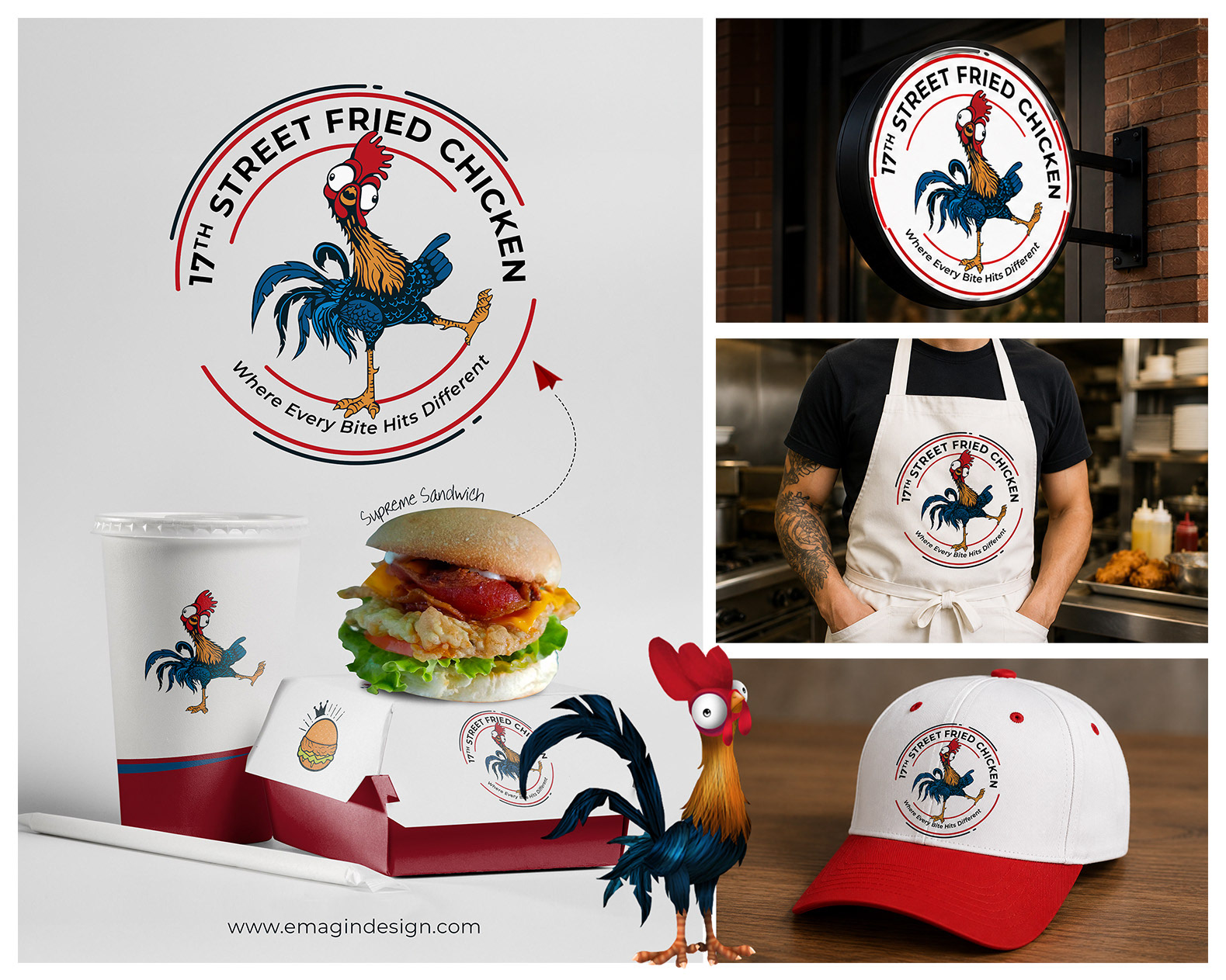
17th Street Fried Chicken
The client envisioned a bold and memorable brand identity inspired by the quirky, animated personality of a well-known comedic rooster character style. To bring that vision to life, we created a completely original, mascot illustration that now serves as the official face of the brand.
The final logo captures the fun, energetic, and flavorful personality of 17th Street Fried Chicken. The expressive rooster mascot adds humor, attitude, and instant brand recognition, helping the restaurant stand out in a competitive food market.
The circular badge-style layout was intentionally designed to create a strong, versatile identity that works seamlessly across signage, packaging, uniforms, merchandise, and digital marketing materials. The surrounding ring elements symbolize unity, consistency, and quality — reinforcing the brand’s promise that every meal delivers a memorable experience.
The bold typography paired with the vibrant red, blue, and gold color palette gives the brand a modern street-food aesthetic while maintaining a welcoming and family-friendly appeal. Altogether, the identity was crafted to feel fun, confident, and instantly recognizable — perfectly matching the tagline: “Where Every Bite Hits Different.”
A logo is a visual symbol or design that represents a brand, company, or organization. It serves as a unique identifier, often combining text, images, or abstract elements to create a memorable mark. Logos can take different forms, such as wordmarks (text-based), symbols (iconic images), or combination marks (both text and symbols). A well-designed logo communicates a brand’s personality, values, and industry at a glance, making it a crucial element of branding and marketing.

The importance of a logo lies in its ability to create a strong first impression and build brand recognition. It serves as the face of a business, appearing on products, marketing materials, social media, and websites. A consistent and well-thought-out logo enhances brand loyalty by fostering familiarity and trust among customers.


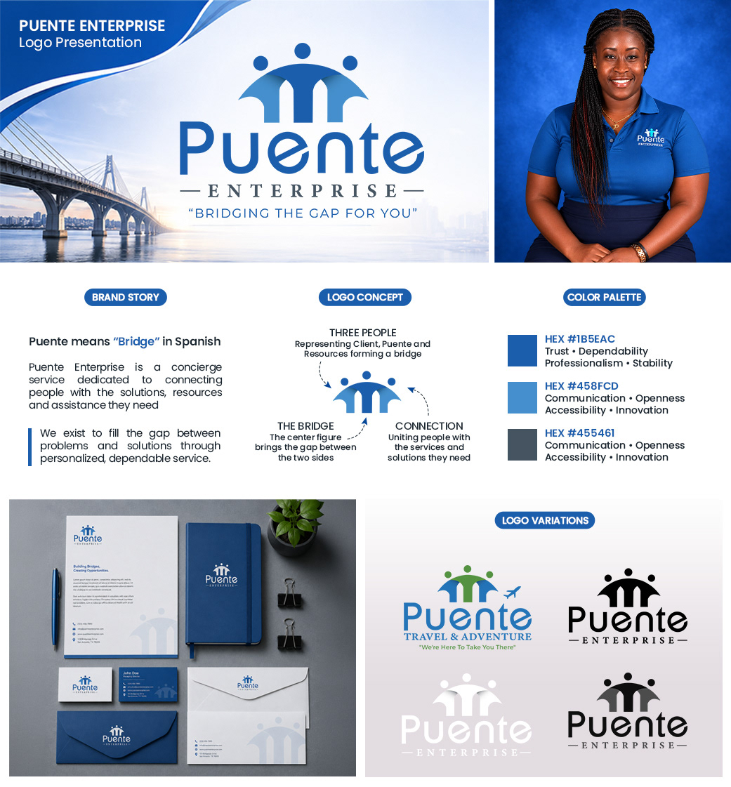
Puente Enterprise
Puente Enterprise is a concierge service brand built around the idea of connection, support, and bridging gaps between people and solutions. The word “Puente” translates to “Bridge” in Spanish, perfectly reflecting the company’s mission of linking clients with the services, resources, and assistance they need.
The logo icon visually communicates this concept through three abstract human figures. The central figure forms a bridge between the two outer figures, symbolizing guidance, reliability, and meaningful connection. Together, the mark represents unity, accessibility, and trusted support.